


........................................................................................................................................................................................................
Redesign of the annual CPH:DOX festival program.
The main idea is to reflect the essence of documentary films by a living and unpredictable layout.
With a quite extended grid I try to create a design which allows all elements to have a "life" of their own.
Each spread is thought of as a frame on a filmroll continuously leading to the next.
The typography is a mix of New Caledonia and Akzidenz-Grotesk.
New Caledonia is a classic book type and has a sense of knowledge and trustworthiness to it. Akzidenz is minimalistic, clean and has a bold "Cut to the chase" attitude.
I believe that combination sums up two important sides of the documentary genre.
This is a school assignment and will not be used in any commercial ways.
I do not own any of the photographs used in this project.
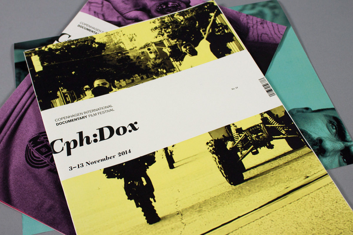
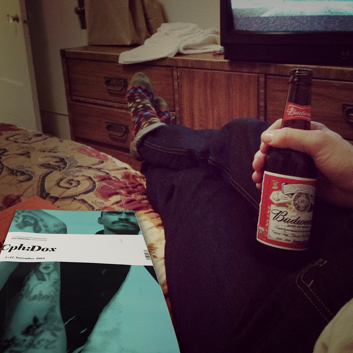
CPH:DOX

Cover

Just to GIF a little overview...

Have a closer look


Cover

Whatever
THANK YOU FOR GETTING THIS FAR.


